EuroPornstar review

EuroPornstar
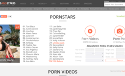
The site’s design is very basic, which got me a bit disappointed. On top, you can choose to list the chicks alphabetically, and there is not really any way you can list them randomly. Also, if you do choose a letter by which to list them, you get a list of names instead of pictures. You will be able to see a small thumbnail after you hover over the image, but that is just bullshit.
It takes too much energy to browse for the chicks this way… so not only is EuroPornstar.com solely dedicated to pornstars, you also have this shitty way of listing. However, I never review a site that is not worth a visit at least a little bit, so stay tuned to see just what this place really has to offer.
Those who are huge pornstar fanatics will surely enjoy this site even without the additional shit, but if you are like me and you just need that something extra, then you should know that here you also have galleries. Personally, the pictures do not do that much for me, but I am quite fucking sure that most of you will enjoy the naughty galleries.
So, if you are interested in the chicks, there are plenty of them. Actually, when I visited they had 4723 girls, but I am sure that by the time you read this there will be even more sluts for you to watch. Every hottie will have a short profile, where you can see her name, if she is natural, does hardcore scenes and all that basic crap. You can also see which sites she is featured on, and below her profile, there will be a bunch of images and her personal galleries.
All the images that are presented are in HD, and while most of them can be opened here, if you choose to open some of the presented galleries, you might be redirected to the original site instead. I honestly expected that shit to happen, since it would be stupid for them to get views when the original content is posted on a different website.
Also, I found it quite fucking stupid that you do not get the usual menu on the homepage… you actually have to choose one of the letters above and list the babes, to get the menu, where you have plenty of other options... What the fuck is up with that? Keep in mind that not everyone is here to explore the website, some might just visit, see that there is not that much shit here, and simply leave.
So, when you click on the galleries, you will again not be able to see the usual menu, and that really pisses me off. So the deeper I go, the more I will have to undo my actions to actually get the options to go somewhere else. I want to know who the fuck designed this shit because that person should be fucking fired. I know this seems like a small fucking thing, but wait until you start browsing a bit more than usual.
The galleries will be listed by the site where they are originally from, so you can choose to view the website for even more content, or you can view just the galleries. It depends on what you came here to see, since if you came to see the naughty bitches in action then you will surely have some fun. You can also find different porn sites that might satisfy your needs better when browsing the shit here.
Excluding that, you also have a special tab dedicated to Euro sex news, if somebody cares… I mean none of the so-called ‘news’ I found there were even interesting, so I am not sure who the hell reads that shit. Do you really visit a porn website to read, or to watch bitches and jerk the fuck off? Also, for some reason every time you open a different tab, the site’s design will slightly change…it gets fucking confusing after some time.


