TeenSnow review

TeenSnow
You want to know my honest reaction when I first pulled up TeenSnow’s landing page? I wanted to close the fucking window and go to a real porn site. This one looks like absolute garbage.
It’s not all the teenage sluts or their depraved sexual antics that bother me. I’ve got no problem with those. The thumbnails look great. Some of them are a little grainy and lower-def than I would like, but the action looks hot: schoolgirls whipping out their tits, cartoon cheerleaders getting their salads tossed, and 18-year-old nymphos getting their faces jizzed on cover the screen.
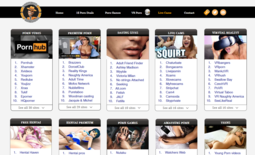
That fucking header, though. I’ll even look past the hideous baby-blue background, but I cannot get behind that header. It’s never a good sign when it looks like whoever made the page put absolutely no time, effort, or money into how the whole thing looks.
You know how every site on the entire Internet has a logo featuring a stylized version of their name? Whether it’s Google, Facebook, or Jimmy’s Backyard Chicken Fucking Bonanza, the name of the site is always written in some kind of fancy letters at the very top of the screen. Actually, “fancy” ain’t even a requisite. They might look like pixelated chicken scratchings, but the important thing is that the logo is there.
TeenSnow doesn’t feel like they need to adhere to the same rules as the rest of humanity. Not only is there no logo, the goddamn plain-text site name is rendered on your screen in comic fucking sans. You don’t have to be a goddamn design nerd to know not to use a font intended for third-grade science projects on a website for grown men with firm grips on their own boners.